Graph visualisation is not merely the conversion of data into visual representations, but the art of making sense of unstructured data and creating informational stories that display their structure, trends, and connections. Regardless of whether you are studying social networks, scientific data, or business metrics, it is important to know how to present information visually to clearly and persuasively show the results of the analysis.
Understanding the Purpose of Visualisation
Any successful visualisation has its purpose. It is important to consider the question before plotting a single point or a line, and ask: What question am I trying to answer? The design of every graph is defined with this aim in mind: the type of graph, the colour scheme, the amount of details, etc.
A bar chart is best used when comparing regions' sales. A line graph is suitable for monitoring the performance over time. A network graph should be used when you want to reveal relationships or interactions, such as those in a social network or in a project's dependencies.
It has a clear purpose that eliminates needless complexity and keeps your diagram on track. The trick is to make each visual detail support the message —that is, help viewers create an intuitive understanding of the data and avoid distraction or confusion.
Choosing the Right Type of Graph
The second step is to choose the right graph type based on your data format and the purpose of your story. All kinds of graphs convey different information, which is why an incorrect decision can make it difficult to clarify or interpret the message.
The typical and common types of graphs are:
- Bar Charts: Ideal for comparing quantities across different levels, such as departments, regions, or time periods.
- Line Charts: Fit best when changes or trends need to be shown over time, such as a stock's performance or a temperature change.
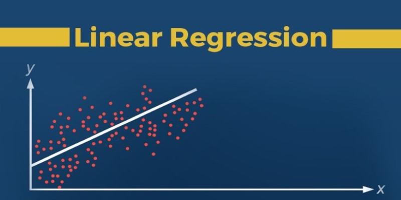
- Scatter Plots: Discover the relationship or correlation between two continuous variables.
- Heatmaps: Data intensity or density is represented by a colour gradient to aid in identifying data clusters or anomalies.
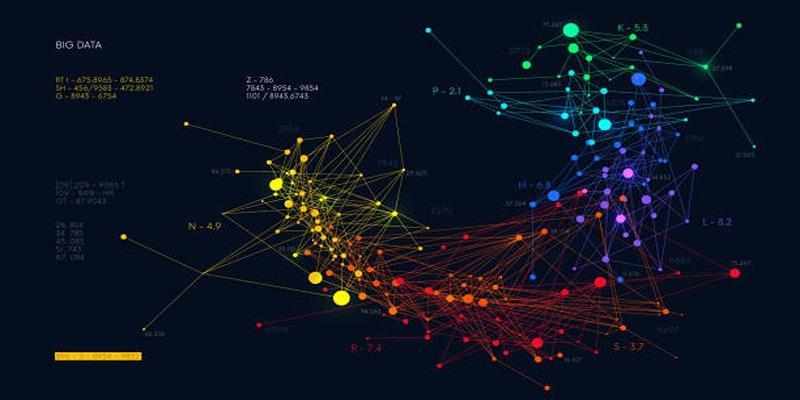
- Network Graphs: Visualise data on relationships and interconnections between entities, ideal for social or knowledge-based data.
Given the complexity of the data, more elaborate visualisations, such as chord diagrams, hierarchical edge bundles, or force-directed graphs, can be helpful.
Preparing and Structuring the Data
Good visualization is made possible by data preparation. The most advanced visual design will never be able to compensate for unstructured or unfinished information. Data preparation guarantees precision, credibility, and a smooth visual quality.
This process entails several important steps:
- Data Cleaning: Find and eliminate duplicates, handle missing values, and fix duplicate entries.
- Normalisation: Standardise formats (e.g., dates, units, and categories) to ensure uniformity across datasets.
- Filtering and Segmentation: Be selective about the most pertinent subgroups of data to achieve your visualisation goal.
- Aggregation: Group data to make it easy to understand, particularly when the data to handle is on a large scale and may be overwhelming to the user.
Organised information brings precise graphics. To illustrate this, all values on the same time scale and at the same geographic location should be combined before forming a population growth chart. Clean and trustworthy data form the basis for informative rather than deceptive visualisations.
Designing for Clarity and Visual Appeal
Design acts as the intermediary of raw information and perception. An effective visualisation conveys the data and offers aesthetic harmony and readability to the viewer.
These are needed in design principles:
- Minimality: Do away with unnecessary gridlines, frames, or excessive color. Focus only on what adds value.
- Colour Theory: Contrasting but equal colors are used to emphasize patterns. The use of hues consistently enhances understanding and readability.
- Typography: Be legible using clean fonts and uniform sizes. Interpretation should be directed by labels rather than being distracted.
- Visual Hierarchy: Organize the content so the most significant information appears first.
- White Space: You should have some breathing room among the items to eliminate visual clutter.
For example, in a sales dashboard, a faint color gradient may indicate an increase in revenue without overwhelming the viewer. A balanced design helps viewers feel intuitively engaged, and thus, interpreting the data can be quick and meaningful.
Integrating Interactivity and Scalability
Interactives are dynamic, whereas static visuals are best thought of as snapshots. Interactivity provides users, rather than passive observers, with the opportunity to explore. Details such as zooming, filtering, and tooltips will enable users to examine specific data and reveal more information.
Visualization tools like Tableau, Power BI, and open-source libraries such as Plotly, D3.js, and Bokeh provide interactive platforms that enable designers to create responsive, scalable graphs. This scalability will ensure that the visual components are efficient, whether on a desktop dashboard or a mobile application.
For example, in a network visualization of customer interactions, the user could hover over nodes to view connection strengths or use clusters to reveal hidden connections. This interactive richness enables data exploration, making it more personal and engaging.
Interpreting, Testing, and Refining the Visualization
Evaluation comes after the building of a graph. The validity of the visualization can be tested by its clarity and accuracy, which will help achieve its desired goal and convey insights.
Begin with the interpretation of results. Are there any significant patterns or relations that the graph brings to light? Are trends easy to identify? Does the scale wrongly improve or give false impressions of the axes? The responses to these questions will identify weaknesses in design or data structure.
Feedback is very crucial here. By sharing your visualisation with your peers, analysts, or stakeholders, you get new insights. When users are confused by some areas, then improve the colour scheme, labels, and legends.
Evolving from Simple to Complex Visualisations

Once you have mastered the simple techniques of visualisation, you can develop more sophisticated versions that present multi-layered analysis. Multiple datasets, dimensions, or metrics may be combined into unified systems of graphical representation and visualisation.
For instance, a project management dashboard could begin with simple bar charts showing task completion rates. In the long run, it may evolve into interactive Gantt charts, dependency networks, and resource-allocation heatmaps. In the same way, scientists could switch to 3D surface graphs rather than 2D plots of interactions among multiple variables.
However, complexity should never compromise clarity. Advanced visuals must remain interpretable, even for those less familiar with the underlying data. This balance between depth and usability is what separates a visually appealing graph from a truly powerful one.
Conclusion
Graph visualisation is not merely a technical exercise—it's a creative process that transforms information into understanding. From defining the purpose and choosing the right graph type to refining design and scaling complexity, each step builds toward a visualisation that tells a clear, compelling story. When done thoughtfully, graph visualisation bridges logic and intuition. It enables businesses to identify market patterns, scientists to understand systems, and analysts to interpret trends with precision.